My Red Robin rebrand is intended to push their business to adapt to the changing ways people order food- being able to get Red Robin quality food on-the go or delivered.
Moodboards and Concepts

I wanted to bring a of red and yellow, but more different tints of those colors to the Red Robin brand.
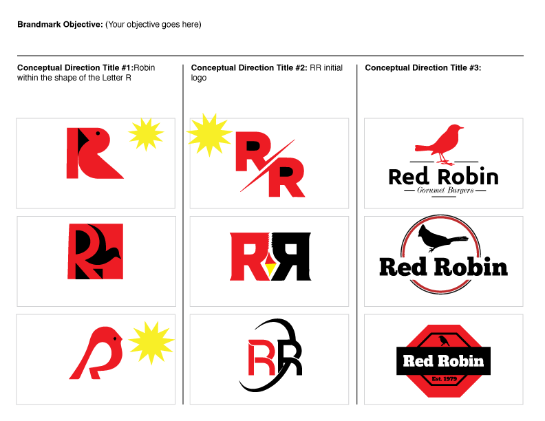
I wanted to really incorporate the robin in the logo somehow, and using that paired with making it in the shape and style of an R was a challenge.


