
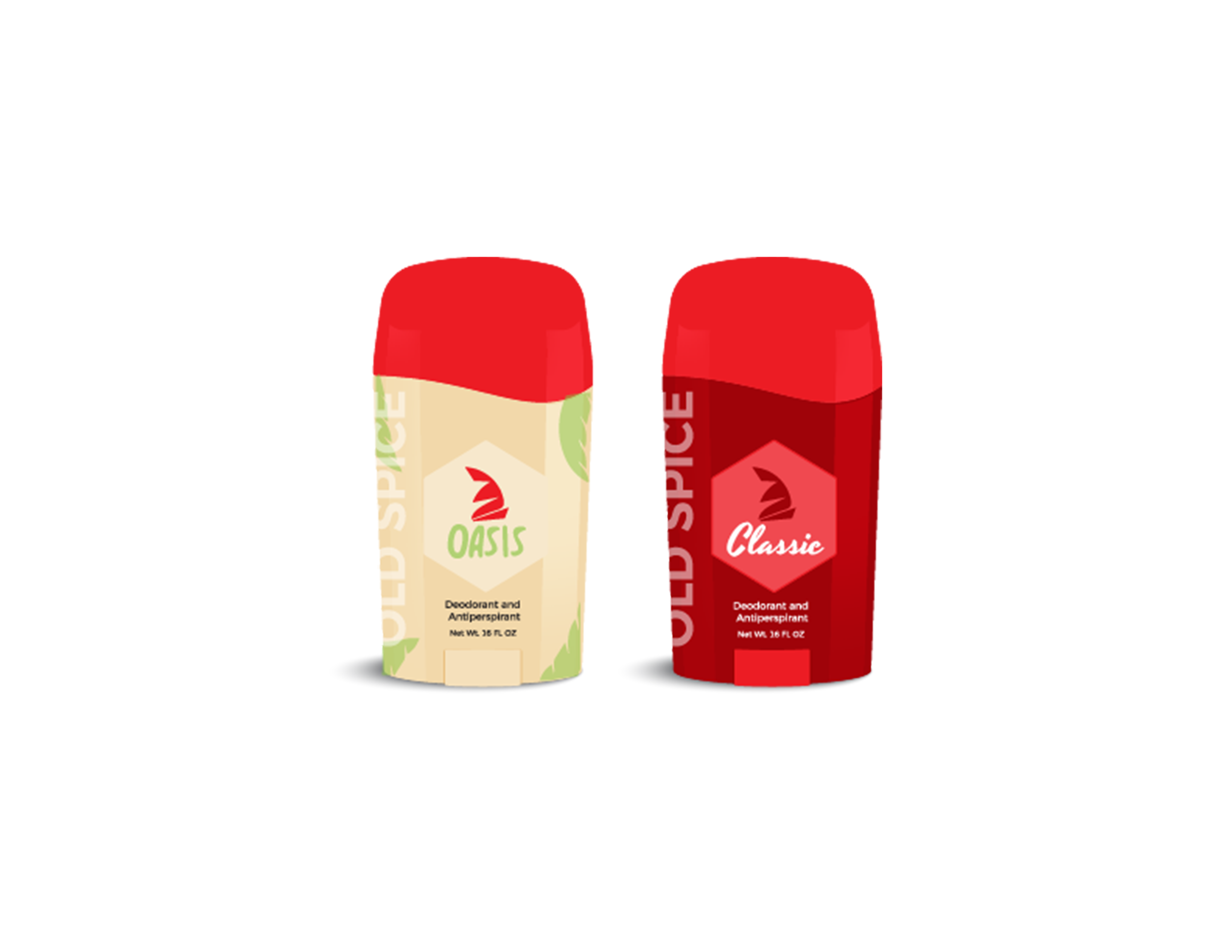
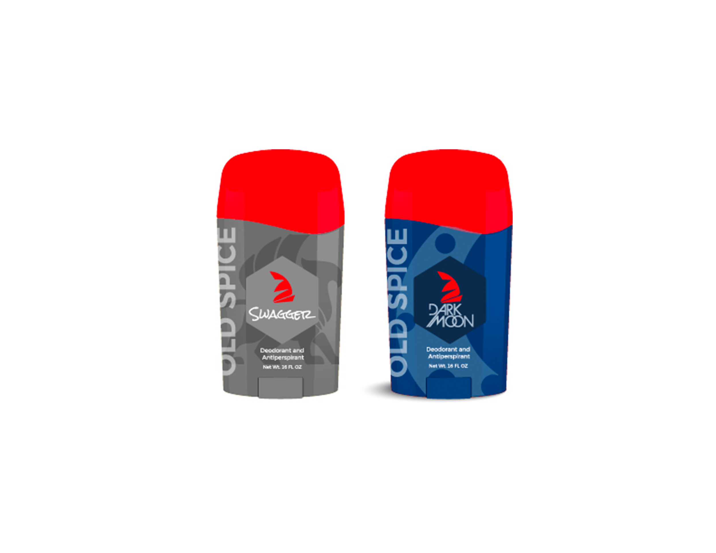
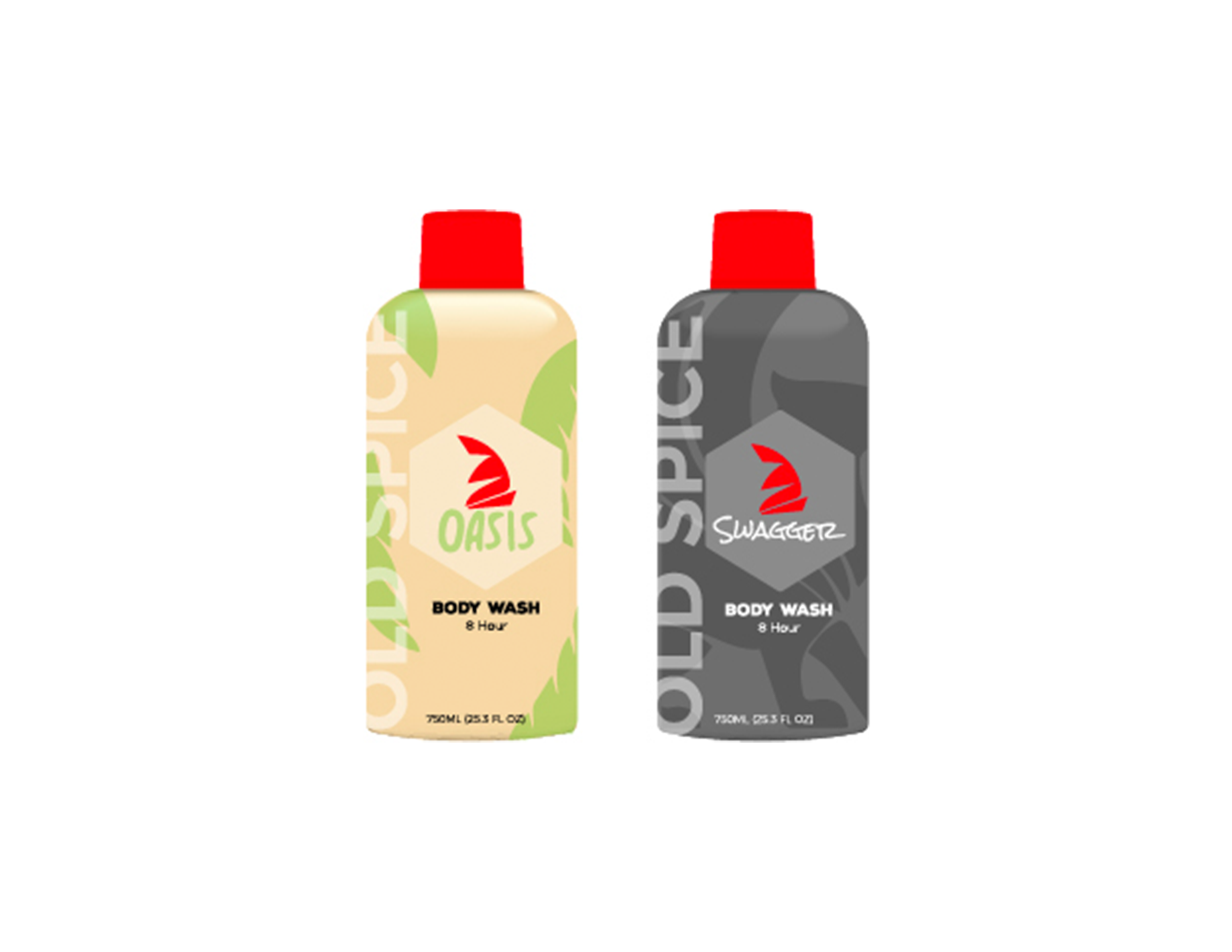
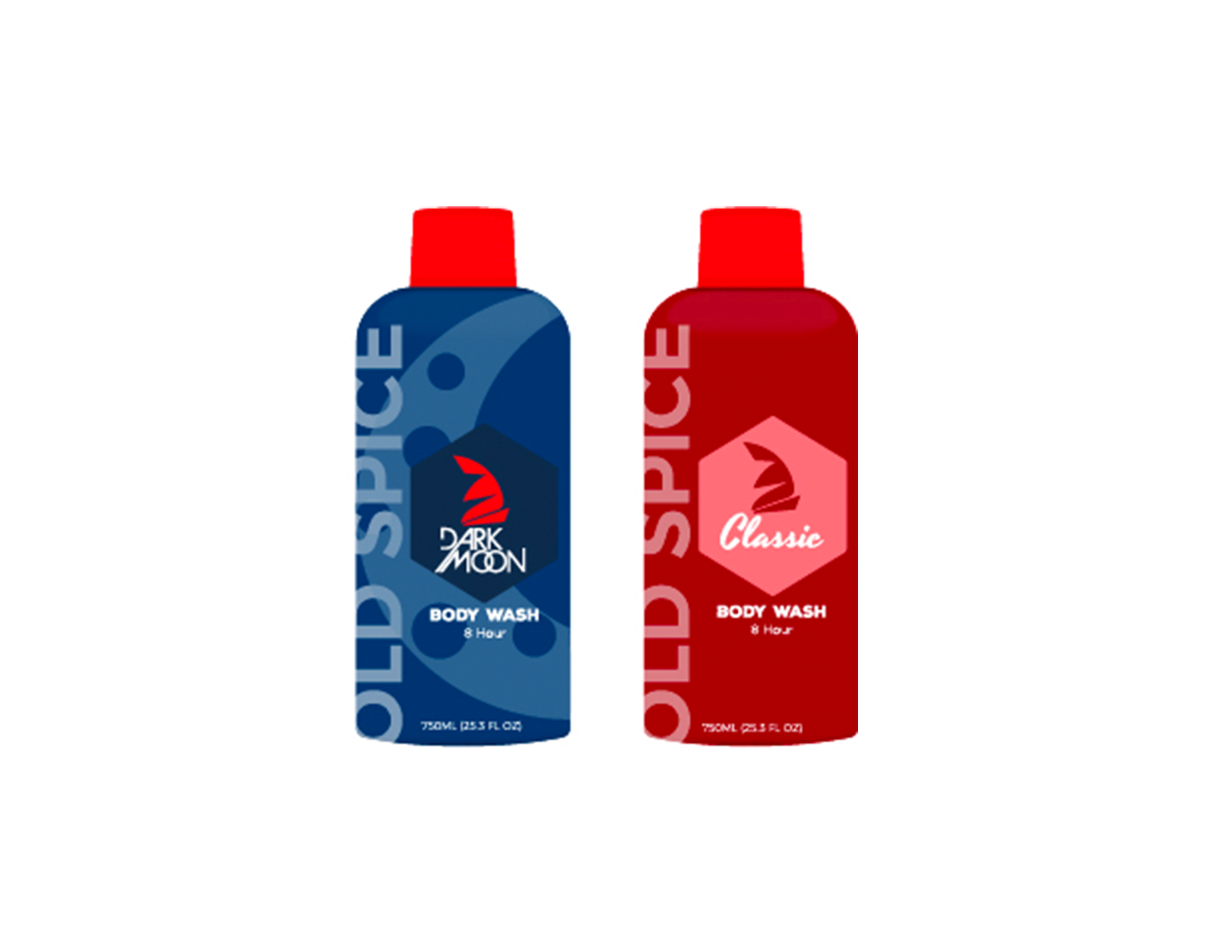
This rebrand idea was fueled by making the brand into something for everyone. Not just men. Everyone deserves their own scent and style to fit their personality.

Moodboards and Concepts

The original direction was always going in a direction and comparing the script fonts for other brands. After a bit I wanted to go to the a bolder and simple font.

In comparison, I felt the old logo to the redesigned one shows the shift that the branding is going in. Going to a bolder font and simpler style shows that Old Spice as a brand is for everyone no matter who they are, and the scent names and colors are all different to showcase that.


